
Sysdyne is happy to announce iStradaView, our newly redesigned Dashboard. The iStradaView Dashboard can be enabled by going to: Settings > Account > Modules > Dashboard type
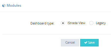
Once you have selected the iStradaView option your Dashboard will now look like this:
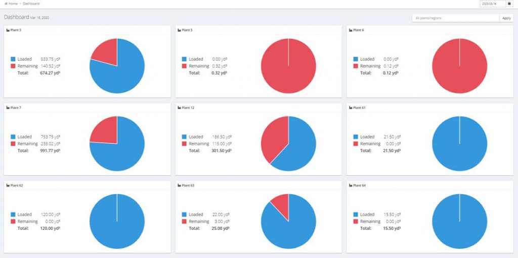
This new view can be filtered by plants or regions (a new resource option we have added to simplify your filtering) and also by day both into the future and the past. Regions can be accessed from the Resource menu and allows you the option to group plants into logical sets of plants for quick filtering of many plants i.e. a metropolitan area central dispatch office.
When you click on one of the pie charts in iStradaView as a concrete producer you will see a list of orders at that plant on that day like the following:
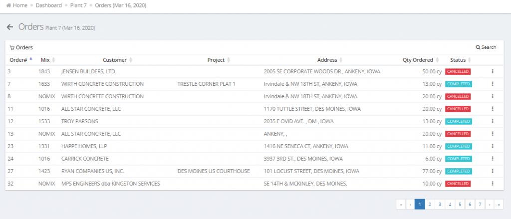
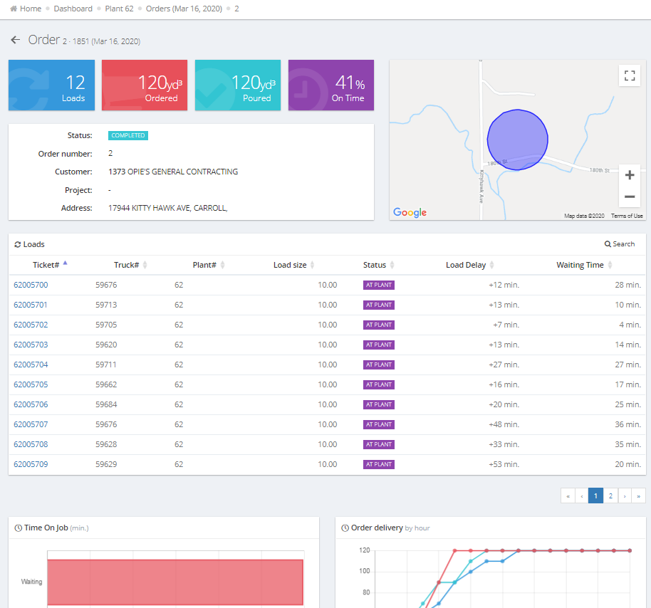
From here you can click on an individual order line to see the Order Details view of the information:
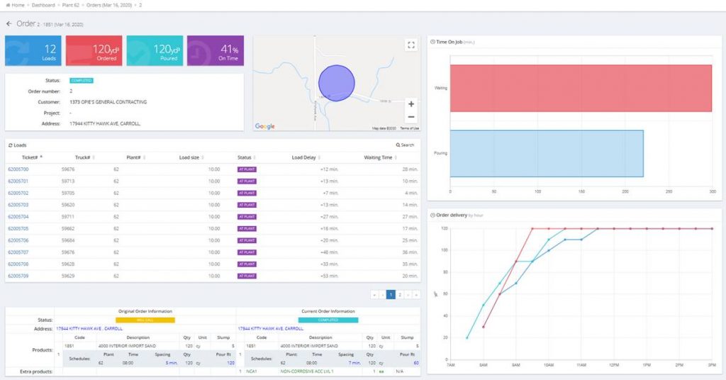
This offers the most detailed level of information we have ever provided about an order in iStrada. You will see:
• Total number of Loads/Tickets that have been created up to the minute.
• Total number of Yards Ordered and Yards Poured.>
• Based on the schedule information provided by Concrete Go you will see the percentage of Loads that were On Time.>
• A Basic Summary of the order information and a Google Maps image of the job site geofence.>
• Each ticket is listed in the central area with a hyperlink associated with the ticket number to allow you to bring up the ticket details you are used to seeing in the Tickets area of iStrada.>
• Just below that is the detailed schedule information about the order. This contains a copy of the original order information which represents how the schedule and products were set when the order is initially saved. In addition to this, we also show the current order information which allows a side by side comparison of how the order has changed.>
• We currently have 2 graphs on the right hand side of the screen:
o The first shows cumulative Waiting and Pouring time at the jobsite.
o The second shows three different pieces of data:
■ Red line – This line is based on the Pour Rate calculated on the schedule. This line increases over time until it reaches the total ordered quantity.
■ Teal Line – This line shows how many yards have been delivered.
■ Blue Line – This line indicates how many yards have been poured.
• The difference between Red and Teal give a visual indicator of how closely you are meeting the agreed upon delivered quantity over time based on the schedule. A gap between Red and Teal indicates you are not delivering the concrete to the job site at the same rate agreed upon based on the Pour Rate in the schedule.
• The difference between Teal and Blue give a visual indicator of whether the customer is pouring the concrete at the agreed upon Pour Rate. If there is a large gap between Teal and Blue there is a large quantity of concrete waiting to be poured on site.
All of this is built with a responsive web design which allows this information to be viewed on everything from a phone to a tablet to a computer monitor.
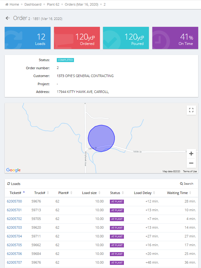
Combined with our all new Sysdyne View App available on both iOS and Android. This new functionality is available at your fingertips from a single app on any device.

